
Brand Assets
Download official Superseed brand assets, logos, and guidelines for your project or partnership.
[01]
Full Logo
[02]
Logomark
[03]
Alternative Logos
[04]
Chain & App Icons
[05]
Token
[06]
Colors
[07]
Usage Examples
[08]
Best Practices
[09]
Visual Guidelines
Full Logo
Use the large logo in all cases where space allows. However, if clarity is compromised due to the thinner lines at smaller sizes, opt for the small logo version, which features thicker lines for improved legibility.

Full Logo - Light
Full logo for light backgrounds
Full Logo - Dark
Full logo for dark backgrounds
Logomark
Large logo should always be used whenever possible. Use the smaller version when legibility is affected due to thin lines in the default logo at smaller sizes.

Logomark - Light
Logomark for light backgrounds
Logomark - Dark
Logomark for dark backgrounds
Alternative Logos
Logo alternatives with a background are available when necessary for better contrast or legibility. These should only be used when the default version cannot be properly displayed.
Alt Logo - Light
Alternative logo for light backgrounds
Alt Logo - Dark
Alternative logo for dark backgrounds
Alt Logo - Brand
Alternative logo with brand colors
Chain & App Icons
This is the Superseed icon. It is also typically used for small applications like favicons or app icons.

Round Icon
For social media and app icons

Square Icon
For app stores and home screens
Token Icon
The SUPR token uses a dark icon on a teal background. This color pairing is only reserved for the SUPR token, ensuring clear differentiation. The small version should be used in most instances.

SUPR Token
Official SUPR token icon
Brand Colors
Click on color values to copy to clipboard
Brand Teal
Primary brand color, CTAs
HEX
#93D0CF
RGB
147, 208, 207
Brand Teal Hover
Hover states for primary actions
HEX
#7DBCBB
RGB
125, 188, 187
Dark Background
Dark mode background
HEX
#0B0B0A
RGB
11, 11, 10
Dark Text
Text on dark backgrounds
HEX
#FBFDFD
RGB
251, 253, 253
Light Text
Text on light backgrounds
HEX
#060606
RGB
6, 6, 6
Medium Gray
Secondary text, descriptions
HEX
#727371
RGB
114, 115, 113
Background Cream
Light mode background
HEX
#FBF8F3
RGB
251, 248, 243
Card Description Text
Secondary/body text such as card descriptions, meta info, or captions
HEX
#565755
RGB
86, 87, 85
Usage Examples
Real-world examples of logo implementation across different contexts
Usage Best Practices
No Alterations: Never distort or change the proportions of the logo.
Clear Space: Ensure enough space around the logo to keep it visible and distinct.
Legibility: If the logo is hard to see on a background or due to size, use an alternative version.
Consistency: Always use appropriate logo styles based on the intended use.
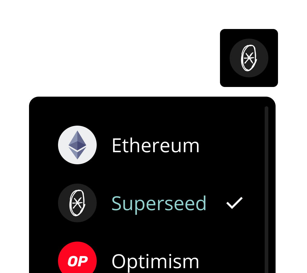
✓ Correct
App icon is used correctly and stays clear in compact dApp views
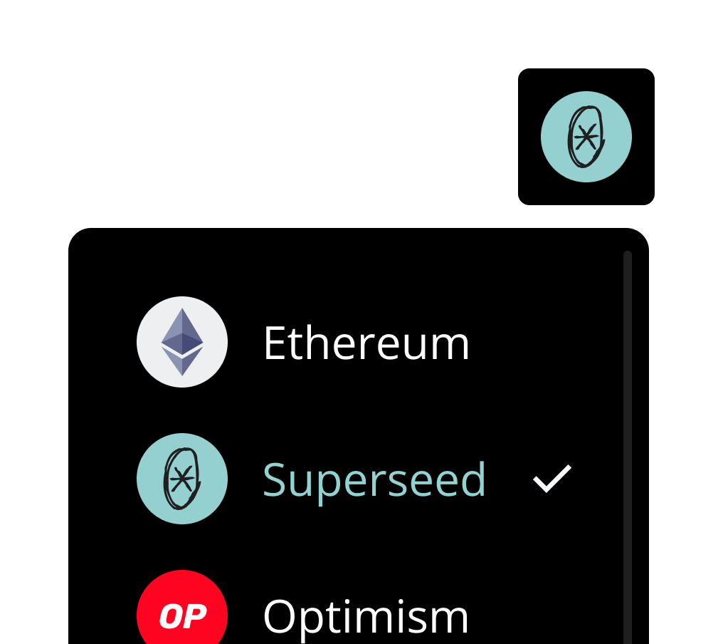
✗ Incorrect
SUPR logo is only reserved for the token, use the app icon instead
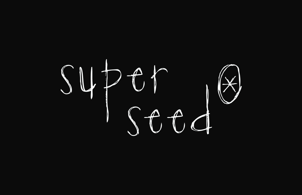
✓ Correct
Logo has good contrast and legibility
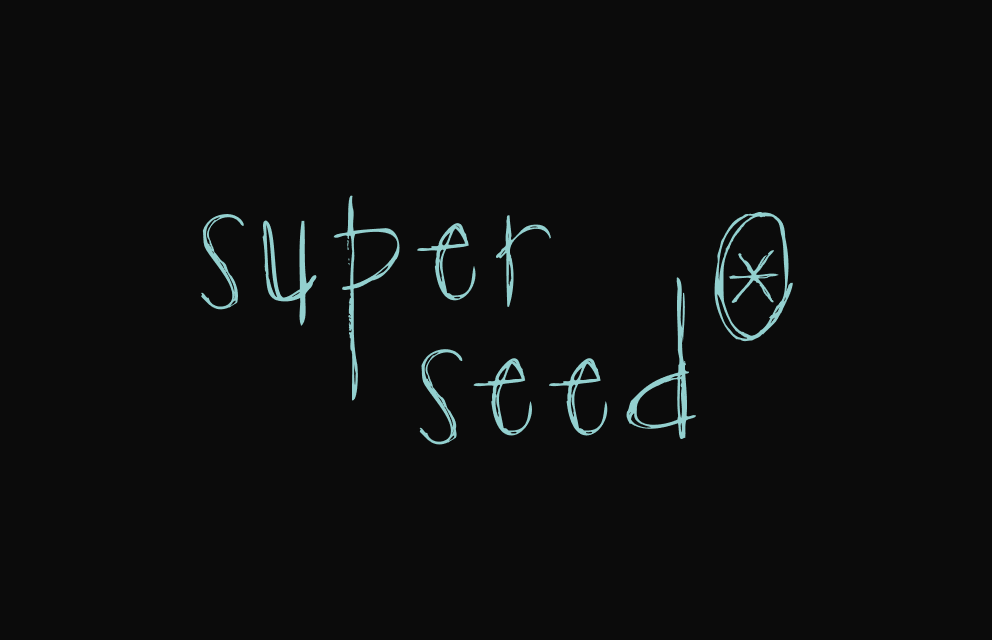
✗ Incorrect
Do not use the primary logo in colors other than light or dark.
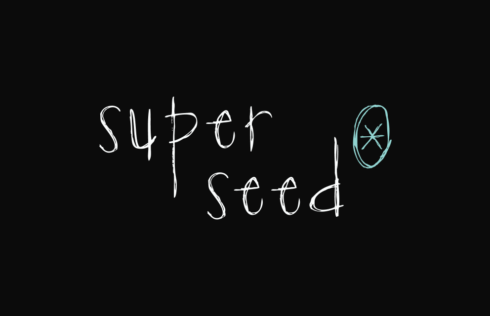
✗ Incorrect
Do not use multiple colors on the logo
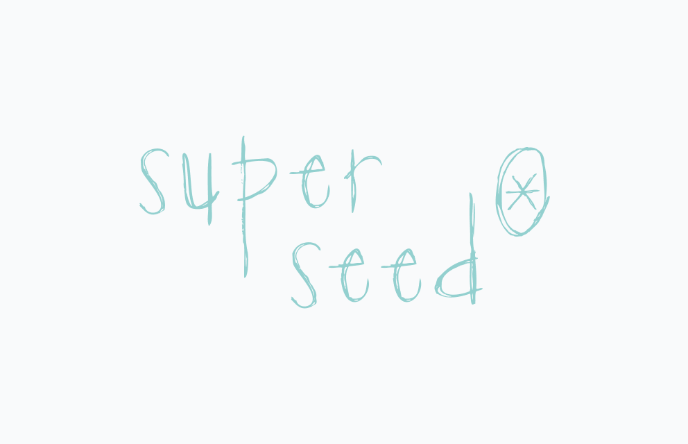
✗ Incorrect
Only use the dark or alternative versions against light backgrounds